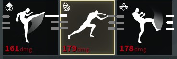
Visualizing Aspects of Moves
Going by the recently posted open letter, future changes following the winter update will be comparatively minor. With this in mind, I focus this post on a singular, hopefully simple to implement proposition (and make an attempt at brevity in the process).

The concept behind the above image is that the sextuplet of lines assigned to each move encompasses all possible attack variations. The triplet used is chosen based upon the direction the attack strikes from. If a horizontal or thrust, one of the lines is highlighted to determine height. In the case of a horizontal, the line is also lengthened to distinguish between the two. Verticals simply light up the entire triplet of their side.
Miscellaneous Points:
1) Obviously far more... Appealing renditions of the above are possible. The bright/dark visuals should fit in nicely with what is established with goldlinking and the various darker effects such as parries, feints, etc.
2) In the upper left we have the move's style, in the lower left the damage, in the lower right the trait (if present). Perhaps the weight of the attack might find a place in the upper right of the box? Not pictured, but I think that one is relatively easy to explain without a sketch.
3) Overall I hope that this suggestion will be perhaps a bit more readily received, due to the more organic way it presents the information to the player, as opposed to previous information-related suggestions of mine. After all, those mostly boiled down to "More text! More numbers!"
As a sort of closing statement, I would just like to thank SloClap for this game and all the effort they put into it postlaunch. It has been quite fun and the winter update should only further improve upon that. I greatly look forward to the studio's future endeavours.
(Add some gunplay to what is there and we could have something remniscent of a franchise that rhymes with dominatrix! Just saying.)
Comments
Great thanks for your kind words and your detailed, illustrated suggestion. I have passed it along to the rest of the team, though we won't promise that it would be implemented in the game. We appreciate your way of sharing ideas, so do not hesitate to post more if you have any!